I’ve mentioned earlier that our team is now busily working on new cooler reports, and while doing that we’ve come up with a brilliant idea to improve report filters as well. Why do we need that? It’s not that we have nothing to do here, there are in fact two good reasons for the tweaks:
- In case there are more than 20 company members or projects, you have to deal with a kilometer-long filter section on your reports page which is not handy at all. Hey, Everhour users with bigger teams, you know what I’m talking about, right?
- Since we are adding more data grouping options in new reports, we can’t let filters lag behind.
We want to share these enhancement ideas beforehand so that you can give us your first feedback and better understand how things will work. Let’s get started.
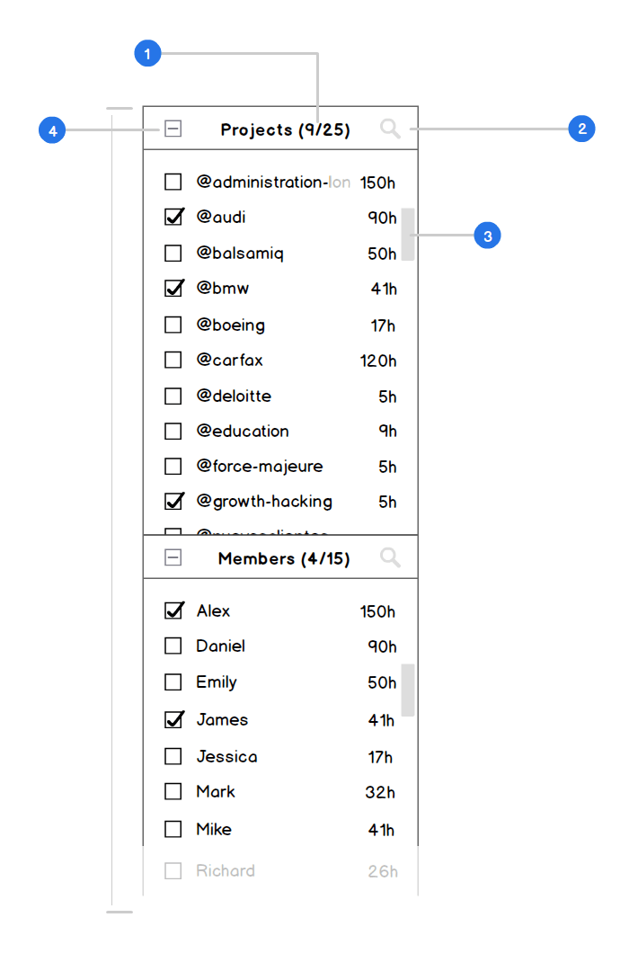
- The filter section title is going to feature the number of selected members/projects and their total number. In case a project/member has no tracked hours, it won’t be displayed.
- We’ll add a search opportunity to let you quickly find a necessary name without looking through the whole list.
- To get rid of the gigantic section length, we’re adding a scroll that won’t let the block go past a certain size. Moreover, we’ve decided that names should be sorted alphabetically vs. by the number of hours tracked as it’s currently done. We believe it will also make the searching process easier for you.
- By default, all members/projects are selected for a report though you don’t see checked checkboxes next to each of them. We’d like to add an explicit way to mark all names selected in one click. Thus you’ll be able to easily exclude a couple of names from the list if needed.
Moreover, we’re going to implement sticky navigation so that you’ll be able to always see the upper part of the filters section on your screen while scrolling down. The visible section length will be adjusted automatically depending on your screen size – you’ll see more projects/members on a widescreen and fewer on a laptop.
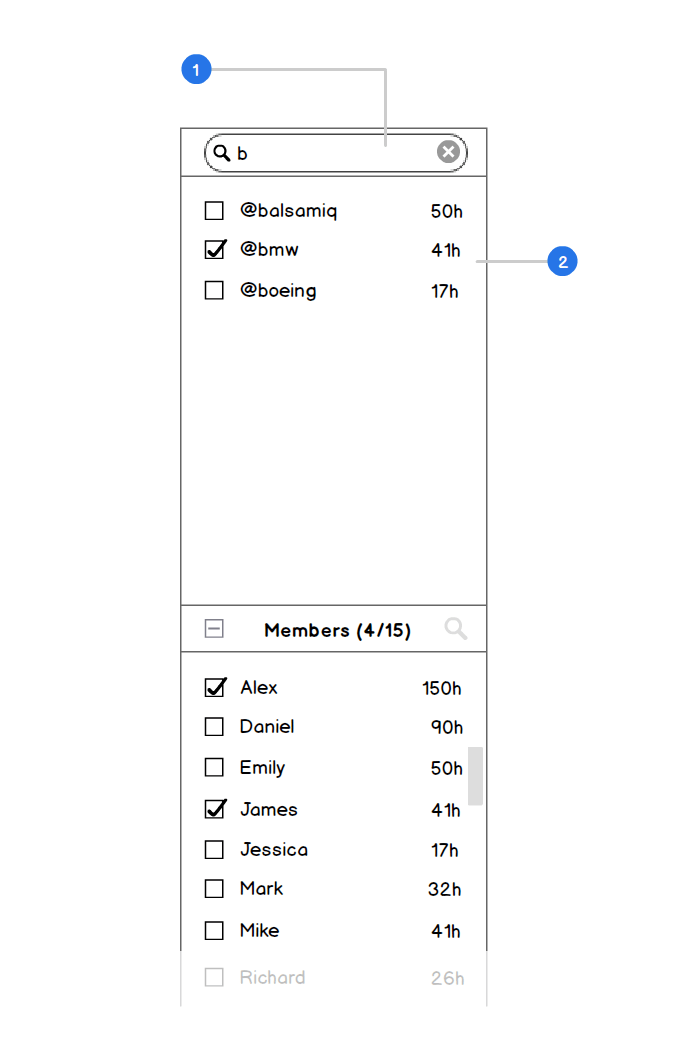
Once you click the search icon, you see an entry field where you can start typing and immediately get as-you-type results filtered by the number of hours tracked.
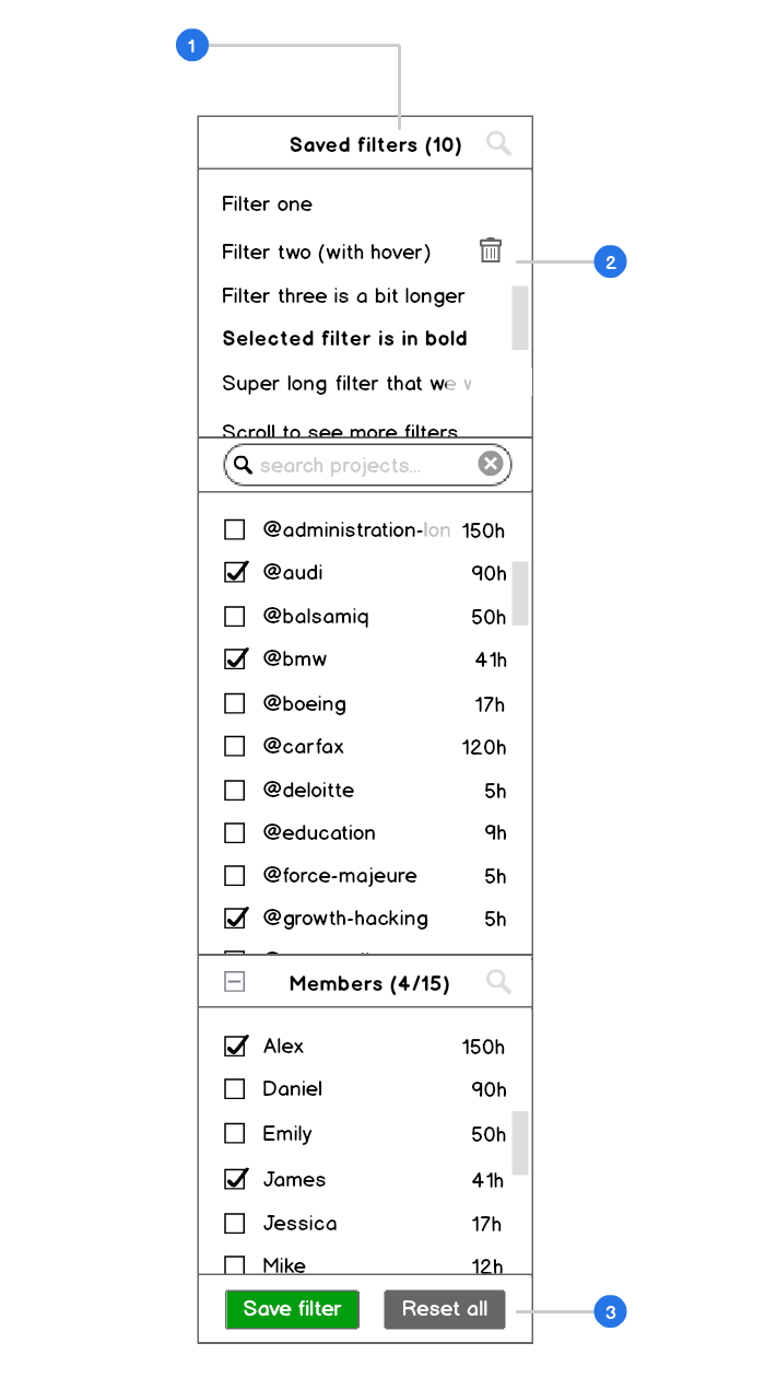
The update will also bring an additional Saved Filters section. You are currently able to save just members-projects filter combination and we’ve come to the conclusion that it’s pretty pointless.
As new reports will involve a wider range of grouping options, we thought it’ll be only logical to give more opportunities for saving how your report should look like.
Click “Save Filter” and your filters combination will be added at the top. By selecting “Reset”, you’ll return to default view settings.
What parameters can you save?
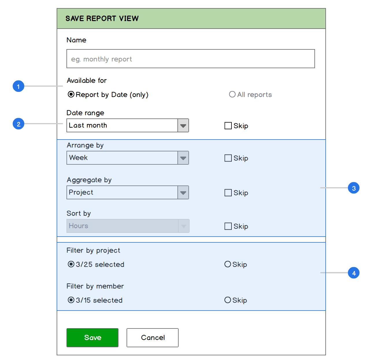
- Choose the types of reports to which your filter will be applied. It can be either the currently viewed report or all reports.
- By default, the app selects a data range that you’ve chosen for this report. You can select another one or pick “Skip” in case you don’t want to override the currently selected date range (or any other parameter).
- You can also save the remaining view options for reports.
- To save the project and member filters, you need to choose them in the filter section beforehand.
And that’s basically it. We’re planning to introduce these new filters together with the updated reports in a couple of weeks which will hopefully make Everhour even handier for you to use.
So what do you think of our little tweaks? We’d love to know your opinion!
