New Time Reports Coming
As it clearly comes from the title, Everhour users are going to soon witness the brand-new time reports. You may wonder: what’s wrong with the old ones? Well, nothing in particular. It was our first attempt in this direction and since the launch, we’ve managed to test the whole reporting concept, understand the pros and cons of each report type.
But as time has passed, we’ve expanded the app functionality and started thinking over further growth, upcoming integrations, and bigger customer teams. All these changes involve new ways of working on projects and thus require a new, better analytics experience to provide our users with.
These new reports we are talking about haven’t been publicly introduced yet, we are still working on them. But we wanted to share what’s happening behind the scenes and our thoughts with you guys, true followers, and ask for your opinion.
Before we started working on the version of the new report, we’d done a big job in researching, accumulating our ideas, and gathering feedback from our awesome customers. Then followed mockups, brainstorming meetings, performance tests, and finally, we ended up with a well-thought reporting concept that would significantly enhance the current Everhour functionality.
Basically, we have 5 report types with their own specific purposes and peculiarities: by date, by member, by issue, by project, and time off. These are working really well and we’re keeping them all, but with some improvements.
The new reports are supposed to solve some general issues we’ve been keeping in mind for quite a time:
-
for large time intervals (multiple weeks, months, or even a year) our current data representation is a bit confusing. It’s honestly hard to perceive, let alone analyze, tons of entry comments;
-
a large amount of data affects performance a lot. And we want every single part of the interface to respond instantly;
-
lack of flexibility for data grouping;
-
lack of subtotals: reports only allow to see the total time spent for a selected time period, however, you can’t view the subtotal, i.e. number of hours tracked for each week within the month, each month within the year, each member or each mention (project) within the selected time, etc.
There have been lots of questions and challenges on the way. Even now there is still uncertainty at some points and we are open to discussing and talking things through. Because even though we’re eager to make reports more powerful and flexible, we by no means want to lose our key features – usability and simplicity.
Ok, enough rambling, let’s get down to business 🙂 Here are the changes we’re planning to introduce to you.
1. Report by Date
This report has a time interval as the highest classification level and answers the question: What has been done during a certain period of time?
Currently, the default minimal time period is always a day. Because of that, when choosing, for instance, last month, you’ll see a report for a 10-people team containing over 1,000 records (22 days x 10 members x 8 entries a day ~ 1,700). It’s scary to imagine how a report for several months or worse, a year, will look like.
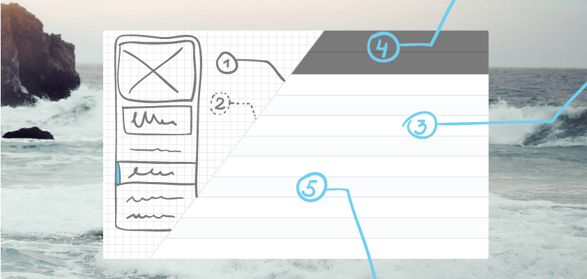
For this reason, we’ve decided to add Options (1) allowing you to choose one of the 12 combinations available for the report.
1. Arrange by {Day, Week, Month} – this is how you arrange your data at the highest level.

The default arrangement type depends on the selected time period. If you’ve chosen the Last Week, we will automatically arrange the data by day; with the Last Month, it makes sense to see the data arranged by week; and naturally, the annual data will be presented monthly. But don’t get confused, these are just default options that seem handy for us, you can change them any time you want.
2. Aggregate by {Mention, Member, Issue or None} – this option defines how data will be aggregated within the chosen time span.
If you choose None, the report will display full-time entries together with the comments.
3. Sort by – this specifies a column to sort by, i.e. alphabetically by member names or by hours (in descending order).
We believe there is usually no need to sort hours ascendingly (it’s logical to want to see the biggest time amounts tracked first) as well as have a “sort by percentage” option since sorting by hours gives identical results.
BTW, we’ve had doubts on whether to keep the “%” column at all or not. We are definitely getting rid of the progress bar taking too much attention and we’ve decided to keep the percentage info as plain text. It might be easier to perceive data in such a way.
Another step we’ve made is removing column headers; all info in columns now seems self-explanatory and thus we don’t have to take up the space for header lines.
Here is another mockup example demonstrating how the data for This Year is arranged By Month and aggregated By Mention:

2. Report by Member
The highest classification level here is a member and the report will show you What a person has been involved in
In this and further reports, you won’t have the Arrange by option in the menu. It makes sense to have it in the report by date whereas here we’ll arrange your info by member anyway.
Because of these very report characteristics, the Options menu gives slightly different alternatives such as {Mention, Issue, Day, Week, Month or None}
The following mockup displays members’ data aggregated by week:

Here is how the report looks like without aggregation (at certain points, like here, we add a Date column):

3. Report by Issue
This report has a mention as the highest classification level and answers the question: What tasks has the team been working on?
Let’s assume you are using a 3d party system (e.g, Github, Trello, or Asana) to manage all your project tasks, and each task has a specific id, e.g. #10.
Multiple team members can participate in the task and track time there:
1. @proj #10 Discuss architecture 2hrs
2. @proj #10 Working on mockups 1hr
3. @proj #10 Testing 30min
The report by issue helps you better analyze time spent exactly on a task. You get to see not just total hours spent, but also what has been done in particular, what has been the most challenging/time-consuming thing, who has been involved, and for how long.
Sometimes tasks could be reopened several times or distributed over time requiring minimal but long-term involvement of team members. In such a case, hours reported during a specific week don’t show the complete picture of efforts spent on the task. And that’s when the report by issue comes in especially handy.
Everhour is currently supporting only GitHub integration but we’re moving towards other tools for synchronization and pulling task id’s & titles to reports.
This is an example of a report by issue showing hours reported by each team member for a specific issue:

An issue title consists of id that is also a link letting you quickly jump to the issue details (the source) and a name synchronized from the corresponding project management system.
Sometimes you might see two numbers in the hours column – the first one refers to hours reported for a selected period (e.g. last month), the number next to it represents the total hours tracked for the issue. In the example, Yury might have worked on issue #746 several months ago. Obviously, you can sort your data by hours as well as total hours.
4. Report by Mention
Currently called Report By Project; this report uses mentions as the highest classification level and answers the question: How many hours have been spent on a project?

5. Report by Event
Currently under the title Taken Time Off Report; the report has members as the highest classification level and gives you information on How many hours someone has been off and on what occasion.
Any company employees have vacations, holidays, they could be sick or simply take a day off from time to time. This kind of time is recorded in the company calendar allowing you to be aware of the upcoming public holidays and team members’ absence.
For now, our calendar features a predefined set of events (day off, vacation, sick day, holiday), but we plan to make them customizable in the nearest future. The report by event aggregates this kind of data for analysis.
The report below displays all days off of each member of the team has had for the last month:

So here is how our ideas and plans regarding Everhour reports look like. To come up with these, we’ve done a lot of thinking and analyzing and believe that such changes will make the app more powerful while still keeping it simple enough.
But of course, it’s your word guys that matters. So tell us, what’s your opinion of the planned improvements? Do you find them handy and necessary? We’re dying to hear from you!

Mike
An IT entrepreneur, executive, and former engineer with a passion for innovation and leadership. Mike focuses on driving company growth while keeping the team inspired. Outside of work, he enjoys tennis, snowboarding, traveling, reading, and, of course, putting his heart and soul into Everhour.