Get Deeper Insights With the New Team Timesheet
Hello, dear readers of our blog! Today I would like to continue the story about the upcoming changes to how admins will manage the staff in Everhour teams. The topic to touch on is what changes in Team Timesheet Dashboard.

A Timesheet Page in the Past
The initial idea of a timesheet was to show team admins how many hours each team member works on a given day. After numerous questions on how to make a team timesheet report, we happily built it and everybody was satisfied.
Now, we see there is a time for a change. This dashboard could give a much better value to your work when it comes to
How Does It Look Now
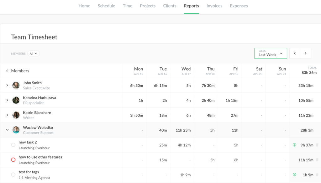
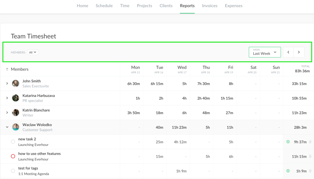
First thing is that navigation changed a bit. You can filter by a member on the left at the top. On the right, you can choose one of 5 last weeks and move to the previous/next period of the same size.

As you may notice, there is no more option to select any other period. The reason is that we want a timesheet to reflect the work done daily. Very soon we will add a brand new feature there that is tied to a weekly period (spoiler: time approval).
The members’ list still occupies the center of the page. It now has a collapsed state where you just see the totals and the expanded state, where you see hours by task for each day. We assume it is much easier now to see the time expenditure. You can add a new task here and enter hours for other team members.

To the left of the sheet are the total for a task and a label with billing status. It could help you better understand what kind of work a team member did.

And if you want to change the status of the task, click on its title, then hit the dollar label.