See Your Activity Faster With Brand New Time Tooltips
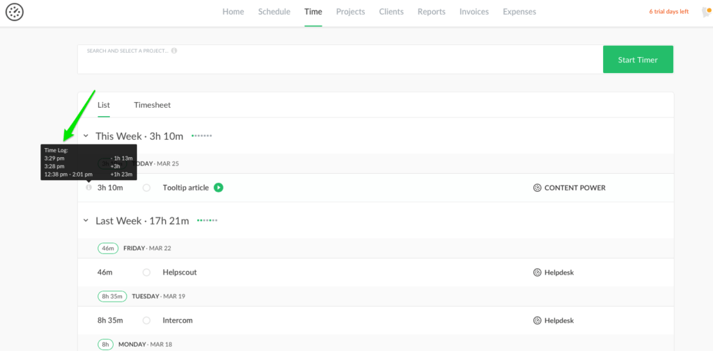
Hi! We are fitting a bunch of new touch-ups to get a full picture of the time entry without de trop steps. Now the tooltip function will also show you promptly whether the time was added manually or tracked via the timer.

The Things as They Were
Earlier the time entry was shown with the yellow dot for the halted time whereas the sign of the little lock depicted the locked time. Imagine, you left your workplace and totally forgot to stop your timer. Then you get an email notification that the timer was stopped by your admin (or supervisor). You checked the Time page and saw the time entry with an orange dot. That means the timer was stopped for the reason of your work finishing.
It goes without saying, that in order to see how you tracked time, you have to open each task, go to its time logs. Too many clicks… that seemed a bit overwhelming.
The Changes as They Are
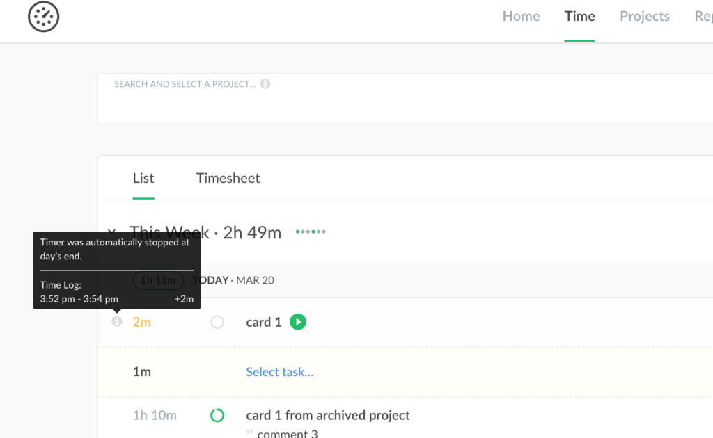
Tooltip displays the whole image of the task time in a new way. The info icon near each time entry includes all the explanatory information of how time is submitted (timer, manually, adjusted). With it, you can see why the timer was stopped too.

A new change is to show three-time colors as statuses for a time entry: orange, black
To be brief, a tooltip option is ever better than digging up for time log and filtering the info you need. Hope this update will optimize your work process making reported time checkup even handier.