Project Summary That Shows Crucial Information About Your Project
Today we are announcing a brand new dashboard called Project summary.
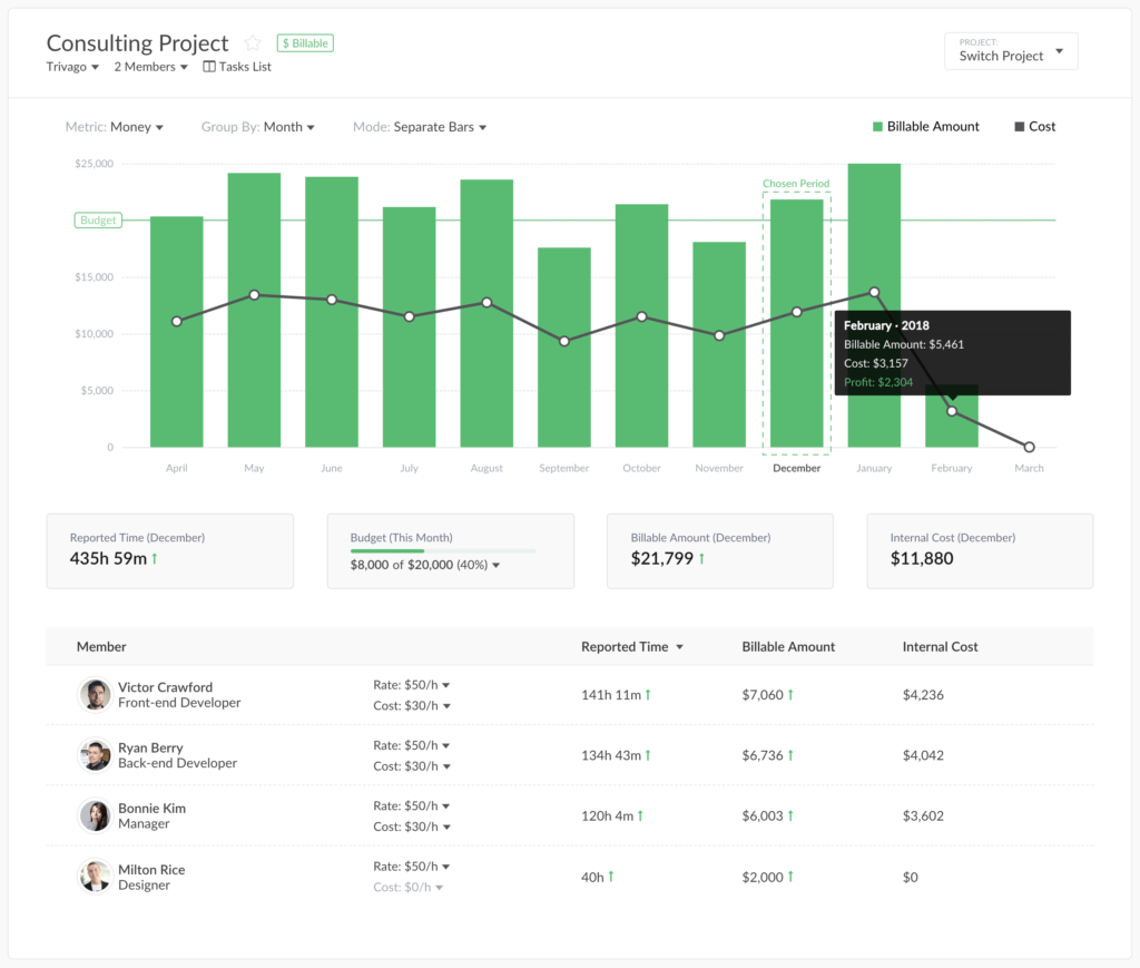
It consists of 3 parts: a chart, project metrics, and details by a member. Let’s see how it all works.
Navigation
How do I get on this page in the first place? Well, you can click on a project name when you are on Home or on Projects pages. Projects from external tools open this view immediately. As for internal projects from Everhour, you see your tasks first and need to click a button opening that view.
Chart
It shows you a time spent on a project, or you can change it to show you the sum based on rates.
When you use it to show time, it is divided into billable and non-billable. When you prefer to see a sum of money, we split it into Billable Amount and Internal cost, i.e. the money your employees brought you vs. the salary you pay them.
This chart can show you month by month or week by week, you can make the bars stand-alone or surge up to show a single picture.
We display a project budget if you have it, so, for general budgets, it is convenient to see the bars surge up. While for recurring budgets it is easier to digest the progress when they stand alone.
You can navigate a mouse cursor on any bar and even click on it to get extra info for that period.
Total Metrics
This block shows the total progress for the given period of your project summaries, such as total time, billable amount and costs. You can see red/green arrows signaling you how the progress changed compared to the previous period.
Members’ table
It shows the high-level individual progress of your project participants for the given period. There is a chance to adjust a member rate or cost right in this view.
Have questions or suggestions? Feel free to send us an email at ask@everhour.com or leave a comment below!
