Changes to Members Page to Make Staff Management a Breeze
Good day to all of our readers! I have a new story to tell you about the design tweaks to the

The Need for Changes
I will start by giving you a rosy future picture: we would like to add a separate page where you can manage your team. It will consist of the team dashboard with capacity and progress, a team timesheet, and a member list.
The idea is to give you a better option to manage your team and see the result of their work at a glance. This is a huge task and I urge you to follow how they unfold in our further product updates. The first step on that road is to make changes in the design of a Members page for admins.
So What’s Changed
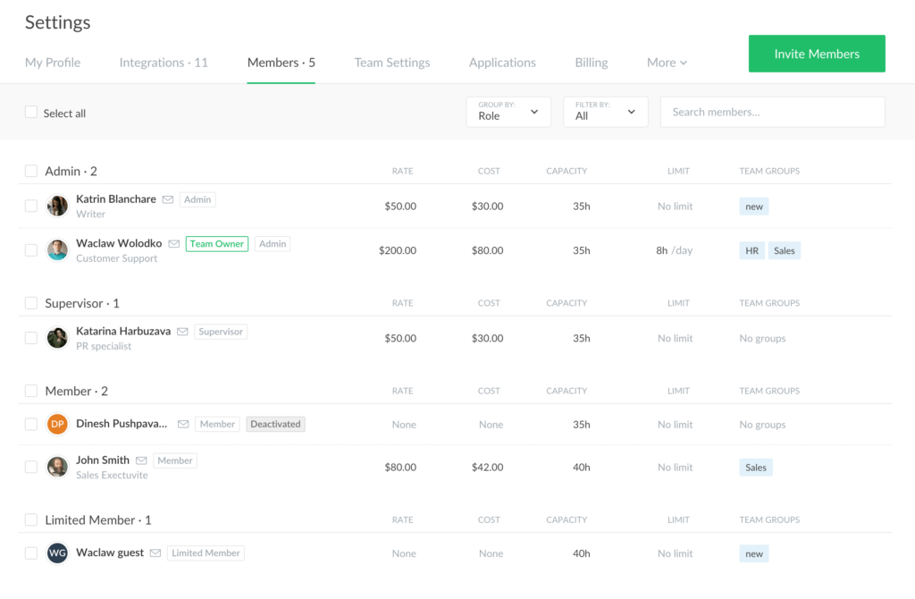
The main change is the density and appearance of the info about your teammates. You still see them divided into blocks by a team role and can group by it or by a user status.
On the left, you can see the name of the user, their role, job title, and email. It can be all changed when you hover on the user name, see the 3 dots and click on them.
We have separated such columns as rate and cost, as well as moved capacity into a standalone section as we want to use it further not just with your schedule. The option to share a schedule for a user can now be found on your applications page.
Team groups are now a separate column too where groups are presented as labels. We collapse them if a user belongs to more than 2 groups.
Keep following our updates to read about a time page.