Tailor Everhour to Your Needs on a New Applications Page
Hey! We continue working on improving the user experience with our app. This update explains how to make Everhour be more adjusted to your daily needs and show only stuff that is important and relevant to you.

Not Using Everhour to Its Full Capacity
We have twigged that some features of Everhour can stay untapped by your team. So the issue was how to hide unnecessary items from the tabs in Everhour.
Moreover, we have several settings and handy features located in team settings, some of them are not widely known to the general public. For instance, lock time editing or stop timer at day’s end are also added to the new page. Through this option, you can switch them on faster.
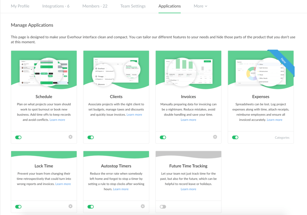
Let’s say, your direct need is to track time and make a report afterward on various projects. Therefore, the tabs like schedule, expenses, invoices may only distract your attention. You don’t want them to show up as active tabs in your account and now you can hide them through the applications page.
Adjust the Product to Your Liking
We added a new page for admin users called Applications located inside an account section. Here you will be able to exclude the applications that are not relevant to your current affairs. These features have several color phases depending on the app status: greenish pages are turned on, greyish pages are turned off.
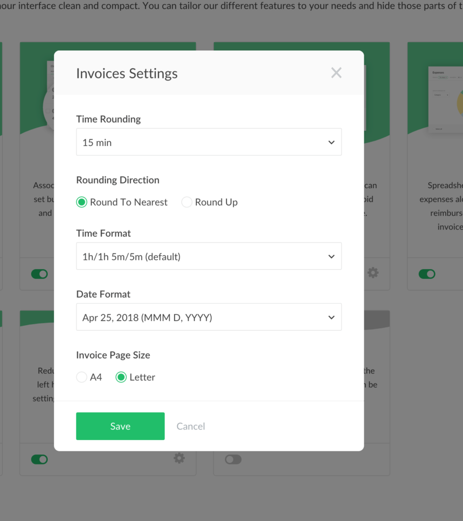
We have moved the control over settings of some apps to this page. When you click on the gear icon for Invoices, for example, you can change its settings here instead of going to the Team settings page.

For now, this applications page contains seven blocks and we are going to enlarge the list as we add more features to Everhour. Soon, you will find Time approval, Budgets, Time Reminders and even more!