A Fresh Member Summary with Better Navigation and More Detailed Information
As you may have noticed, Everhour strives to unify its design across all pages and dashboards. Today’s update cheers a fresh Member Summary look.

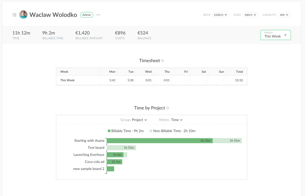
We put a great effort not to just make visual changes but also to make a page more informative. We know that many users like to check summaries to dive into the details of employees’ work, so we added a lot of useful pieces of data.
Want to find out more about what’s changed for admins and members? Read on!
What’s Changed for an Admin
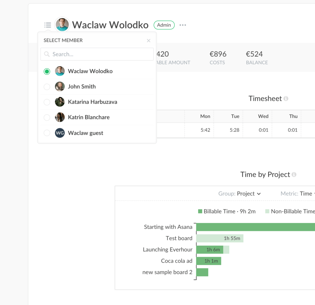
The top of the page contains settings to change the profile, role, and team group, as well as rates, costs, and capacity. There is a quick member select left to the name – don’t open your Home page to switch to another profile any longer!

Timesheet replaced previous daily totals. A good place to find what is missing and fill in an empty cell!
Then go to the dashboards you know well and love: Time by project, Top Tasks. The new stuff we’ve added is expenses, which appear if you have any associated with this member. A monthly summary now also shows up for an individual user.
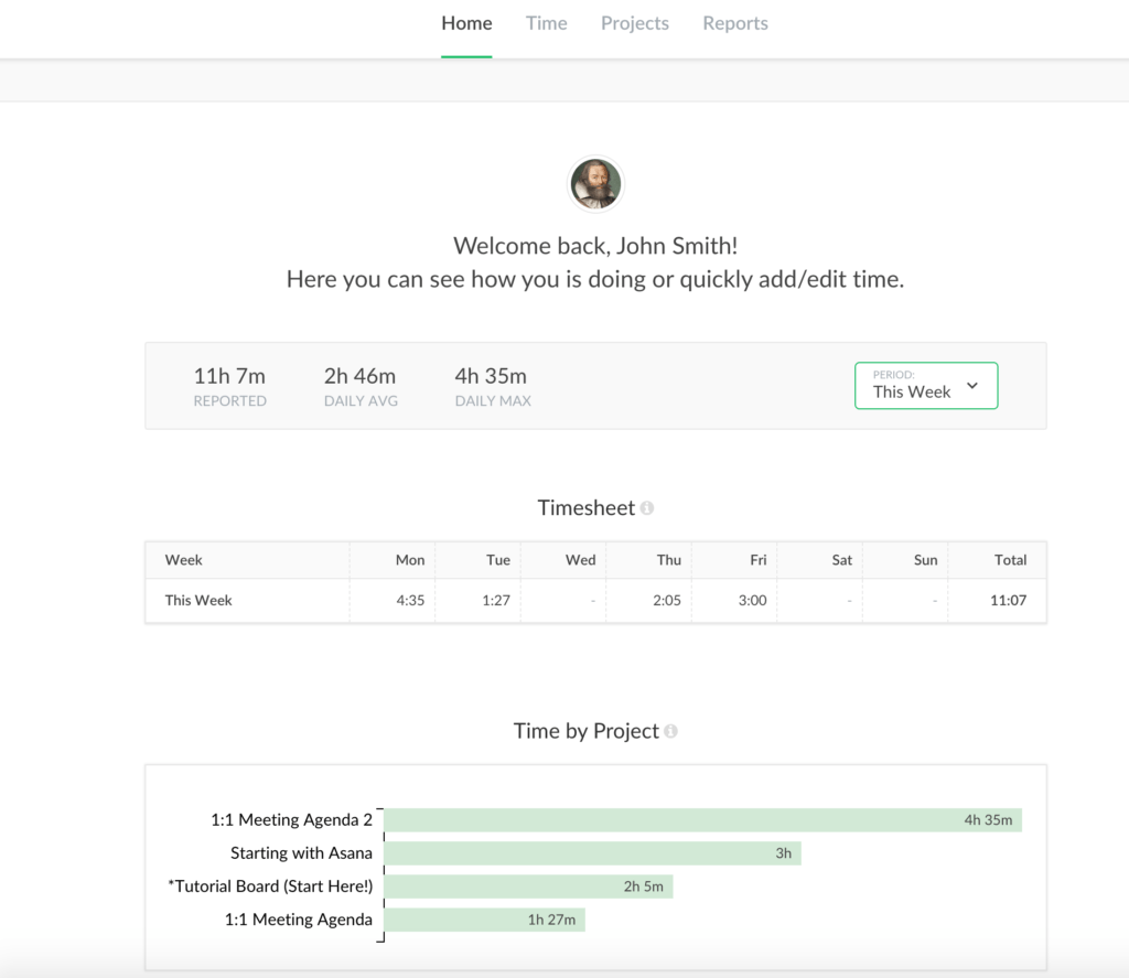
What’s Changed for a Member

As for the members’ benefits, they now have a fantastic bird’s eye look at what they did. First, go to the period and overall statistics. Then you have a timesheet to enter and the correct time. For data freaks, we display a time by project, top tasks, and monthly summary.