Schedule Page Gets Some Polish
Hi! Our team strives to add more and more helpful features for the sake of user convenience and visibility. Here the schedule improvements are racing over.
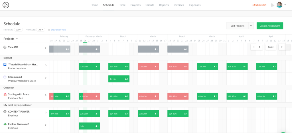
In the past, we received a handful of messages that our schedule page needs UX tweaks. Specifically, the process of including projects and members, which is the first step to planning resources. So we addressed this issue and some others to make its usage pleasant. Dive in to check out the refined schedule page!
A Faster Way to Add Projects and Members
The latest schedule improvements facilitate users’ intuitive usage. We decided to renew the mechanism of projects and members’ addition.
Earlier you had to go to the Projects page to turn the schedule on. This extra step, which users found non-intuitive, compelled us to show all the active projects in the schedule by default.
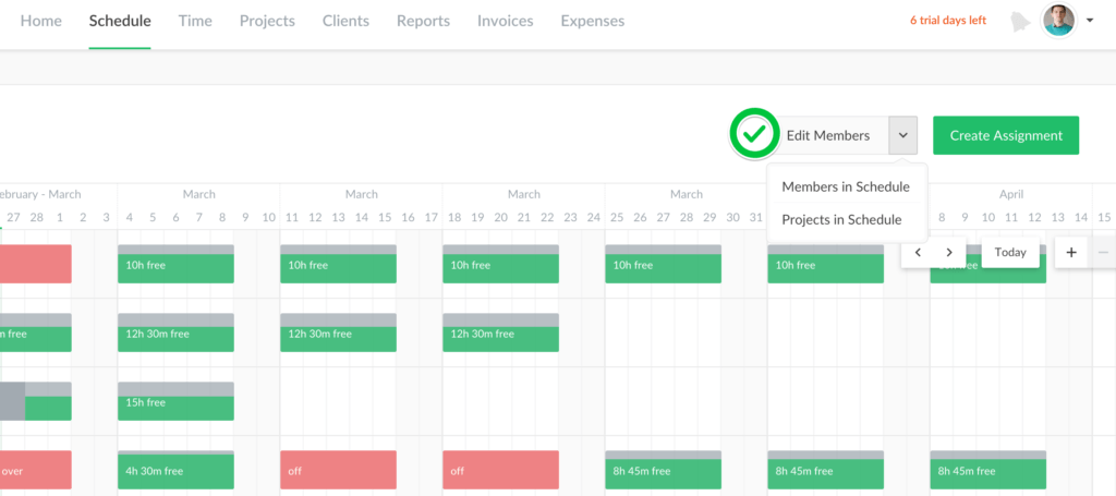
You thus should select a project or a member by clicking on the button Edit Projects. There you choose between Projects in Schedule or Members in Schedule to add on your page.
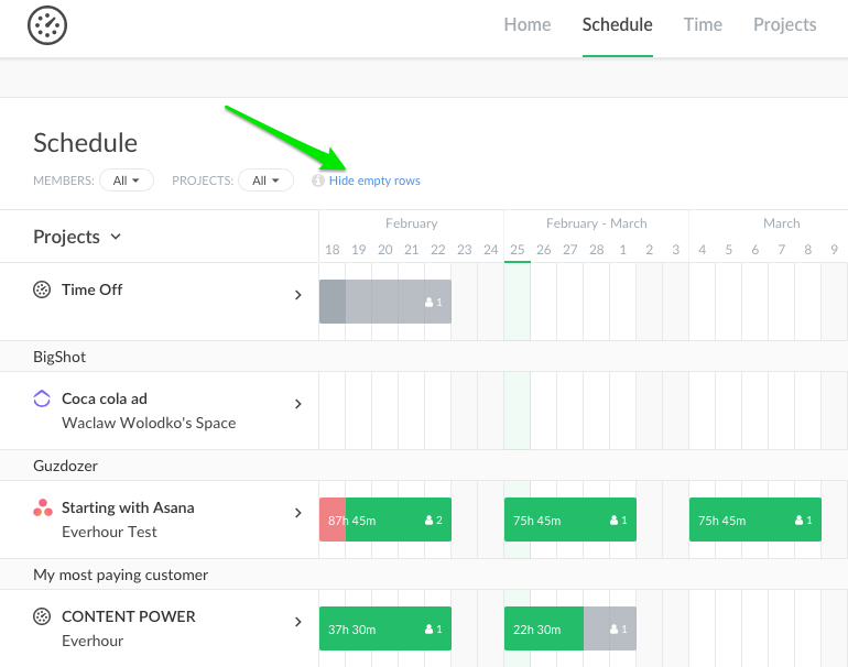
Sometimes, you could have several assignments located at the beginning or at the end of the field. Then you get some space between the lines totally blank. It looks not nice and steals too much space. But now blocks without assignments can be easily hidden.
In addition to that, you also get the ability to filter your projects and members above the schedule.
Making an Assignment to Several Members
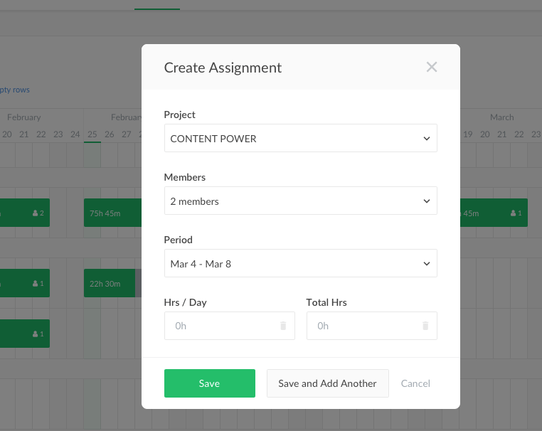
Imagine you need to set the days off (any public holiday) for the whole team. It was unrealistic before and you had to assign member by member… But now, we allow picking up more than one member for a project assignment at once.
By the way, when you open a list of projects to make an assignment, you see all, even those not previously included. Just select a project and we will auto-enable it!
A New Option to Group By
Now you can see the projects grouped by a client, yay! Clients are sorted alphabetically, so do members in each client block. Time Off project is always at the top, whereas projects without a client are located at the bottom of the list.
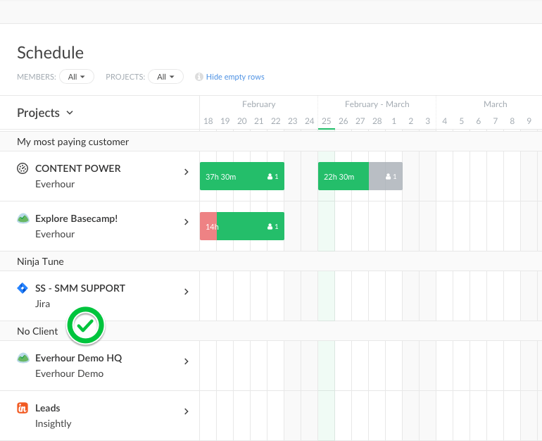
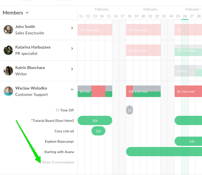
In case you make no assignments, the overview list will show the first 20 projects. In the group by member mode, first come projects with assignments, alphabetically. Unscheduled projects are hidden, and show up also in alphabetical order when unfolded.
Float Navigation Is Sleek
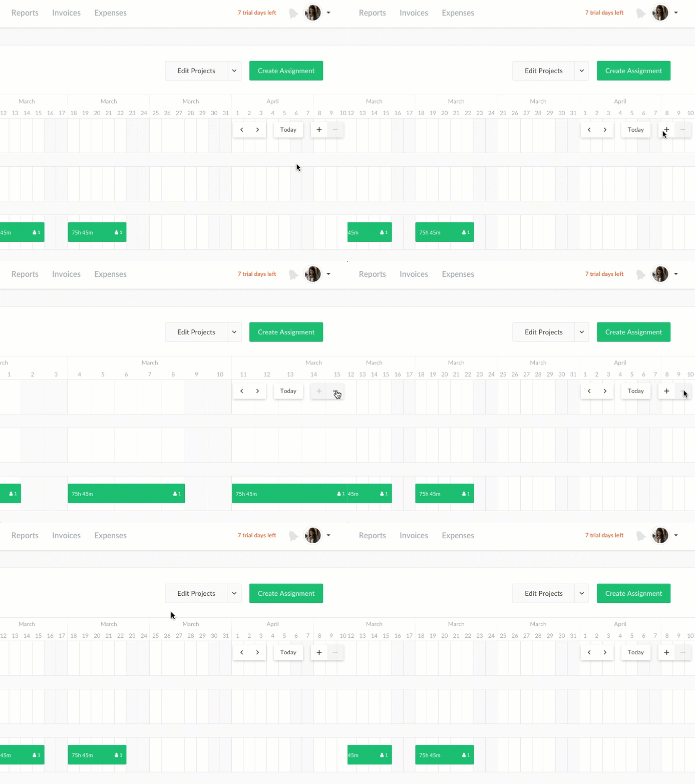
Our team also nicely refined period navigation. You can use it from the very right corner of the schedule, atop other content. We highly enjoy the option of toggling schedule size with zoom-out or zoom-in and switching between a day or a week.
So far, that is all. Follow the hottest updates, and we will please you over and over!