


Reports, Upgraded: Faster, More Flexible Way to Work with Your Data in Everhour
We’ve made a major update to Everhour Reports.
Over the past few months, we’ve been rebuilding the foundation of Reports while also adding new ways to organize, visualize, and export your data. The result is a more flexible reporting experience that makes it easier to get a quick overview, explore the details, and create reports that fit your workflow.
Here’s what’s new.
A new way to organize grouped reports
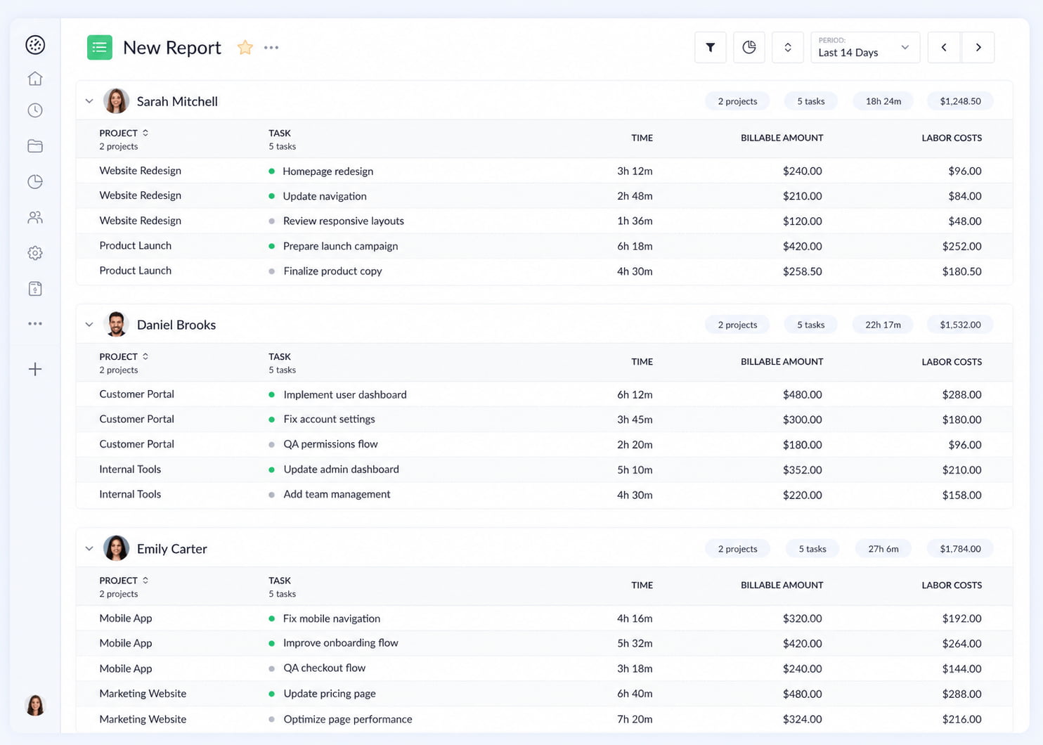
Reports now have a new Sections layout.
Previously, when you grouped a report, all groups were displayed within a single table. With Sections, each group gets its own table, creating a clearer separation between groups and making some reports much easier to scan.
You can now choose between four layouts:
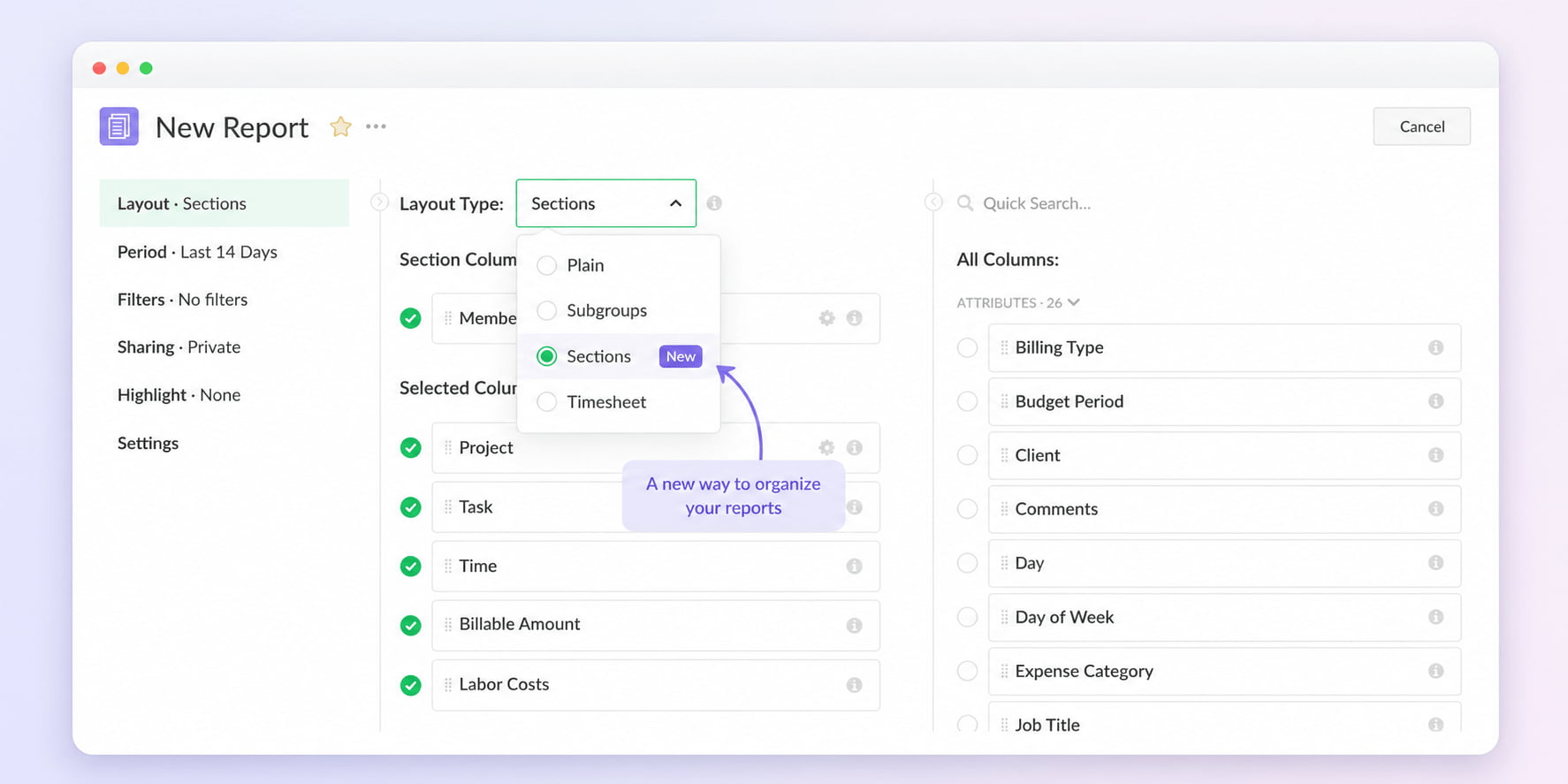
Sections can be especially useful for reports where you want to clearly separate projects, team members, clients, or other groups rather than viewing everything as one large table.
See the big picture with charts
Reports can now automatically turn your data into a visual overview.
Click the chart icon in the report header to open the Report Overview. It uses the columns in your report to automatically generate relevant metrics and breakdown charts. This gives you a quick way to understand the overall picture before diving into individual rows.
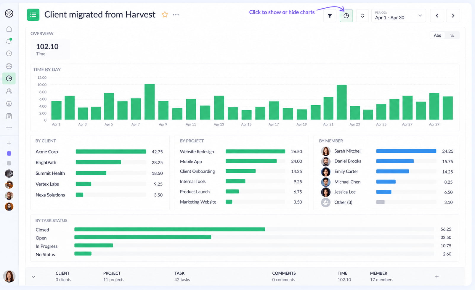
For example, you can quickly see:
- where most of your time is going
- which projects or team members account for the most time or cost
- how work is distributed across clients, statuses, workspaces, and other dimensions
- how much estimated work has already been tracked
You can click a metric to explore a different breakdown and switch between absolute values and percentages depending on what you want to understand.
The overview adapts to the report configuration, so different reports can provide different visual summaries based on the data you’re working with. The idea is simple: get the big picture first, then use the table to investigate the details.
Bring time off and expenses into reports
Reports are no longer limited to tracked time.
You can now include Time Off and Expenses directly in your reports, giving you a more complete view of your team’s activity and costs.
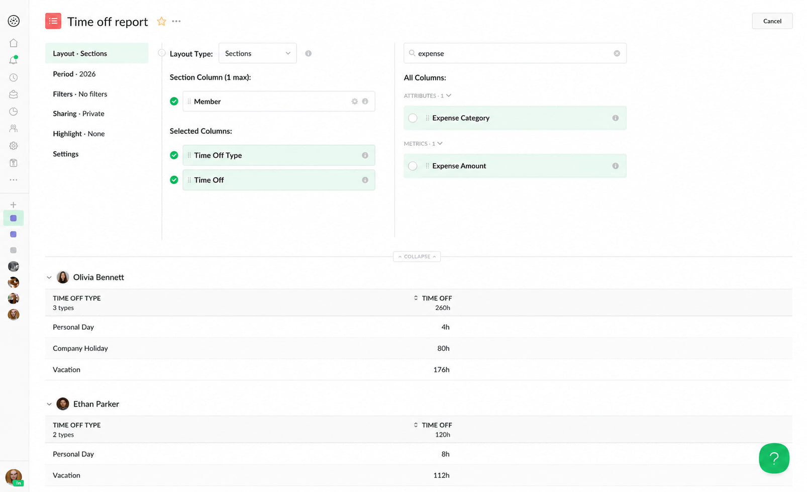
New columns include:
- Time Off
- Time Off Type
- Expense Amount
- Expense Category
These fields can also be used in filters and highlight rules, just like other report data.
This makes it possible to build reports around specific use cases — from understanding how time off is distributed across the team to combining tracked time and expenses for a more complete view of project costs.
Better PDF exports
We’ve also made PDF reports better and faster, with a few useful new configuration options. For example, you can now choose the PDF layout directly in Report Settings:
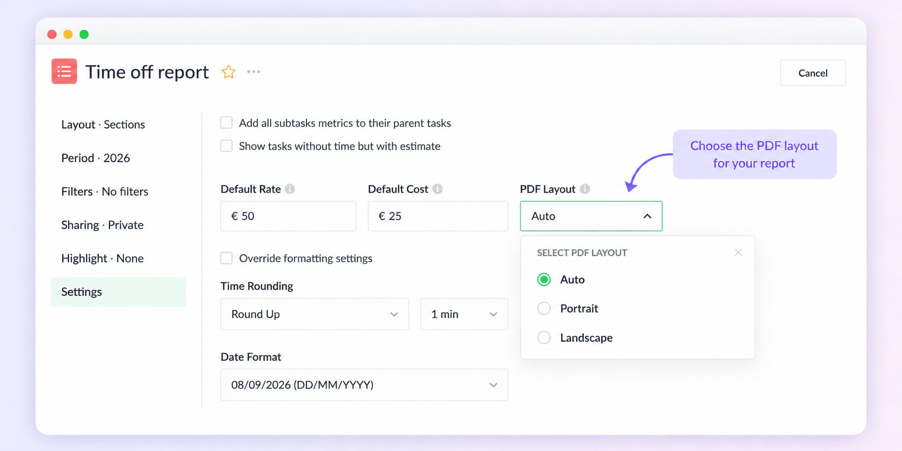
- Auto — automatically chooses the best orientation based on your report
- Portrait
- Landscape
We’ve also improved how very wide reports fit on the page by proportionally resizing columns when necessary.
The setting works across Plain, Subgroups, Sections, and Timesheet reports and applies both to downloaded PDFs and reports sent by email.
A new foundation for reports
A lot of the work behind this release isn’t immediately visible — and that’s intentional.
We’ve rebuilt the underlying Reports engine to make it faster, more flexible, and easier to extend. This gives us a much stronger foundation for adding new columns, filters, calculations, visualizations, and other reporting capabilities in the future.
Along the way, we’ve also improved many smaller parts of the reporting experience — from filtering and sorting to column configuration, exports, formatting, and responsive behavior.
There are plenty of smaller improvements that are easy to miss but make Reports more convenient to use. For example, you can now resize columns in Timesheet reports to give more space to the information you care about. There are many changes like this throughout the new Reports experience, but listing every small improvement would make for a very long (and not particularly exciting) changelog.
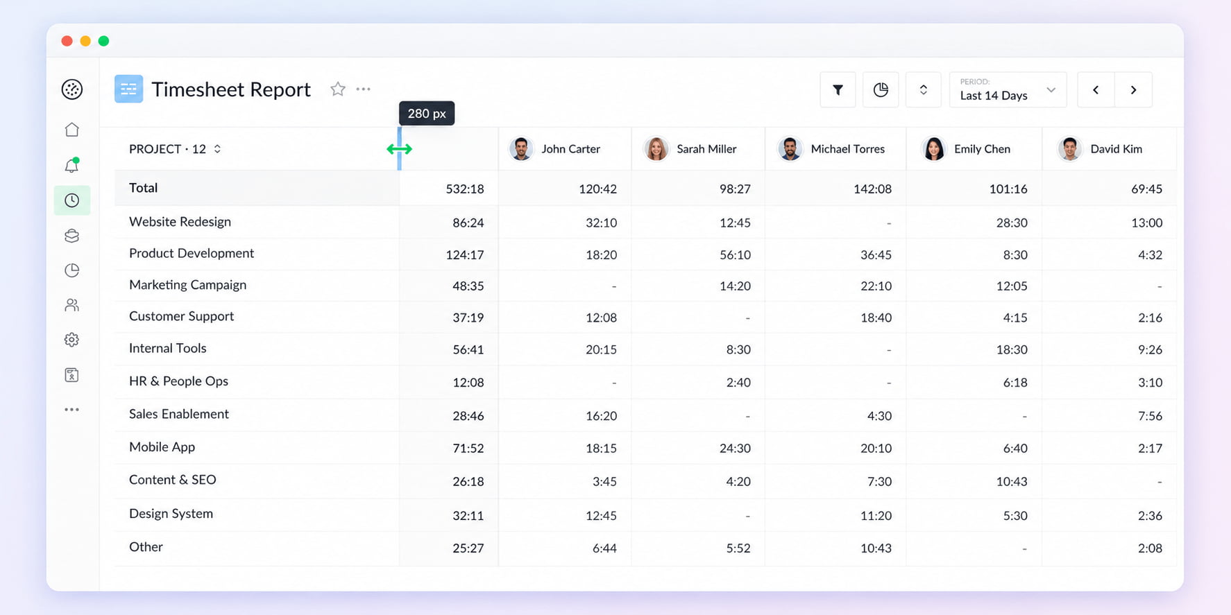
So while some of these changes are visible today, the bigger benefit is that Reports now have a much stronger foundation for what comes next.
What’s next
The new Reports foundation also gives us room to work on some features we’ve wanted to add for a while. Here are two things we’re currently working on that we think will make Reports even more useful.
Calculated columns
We’re working on Calculated Columns, which will let you create your own metrics using simple formulas based on the data already available in your report.
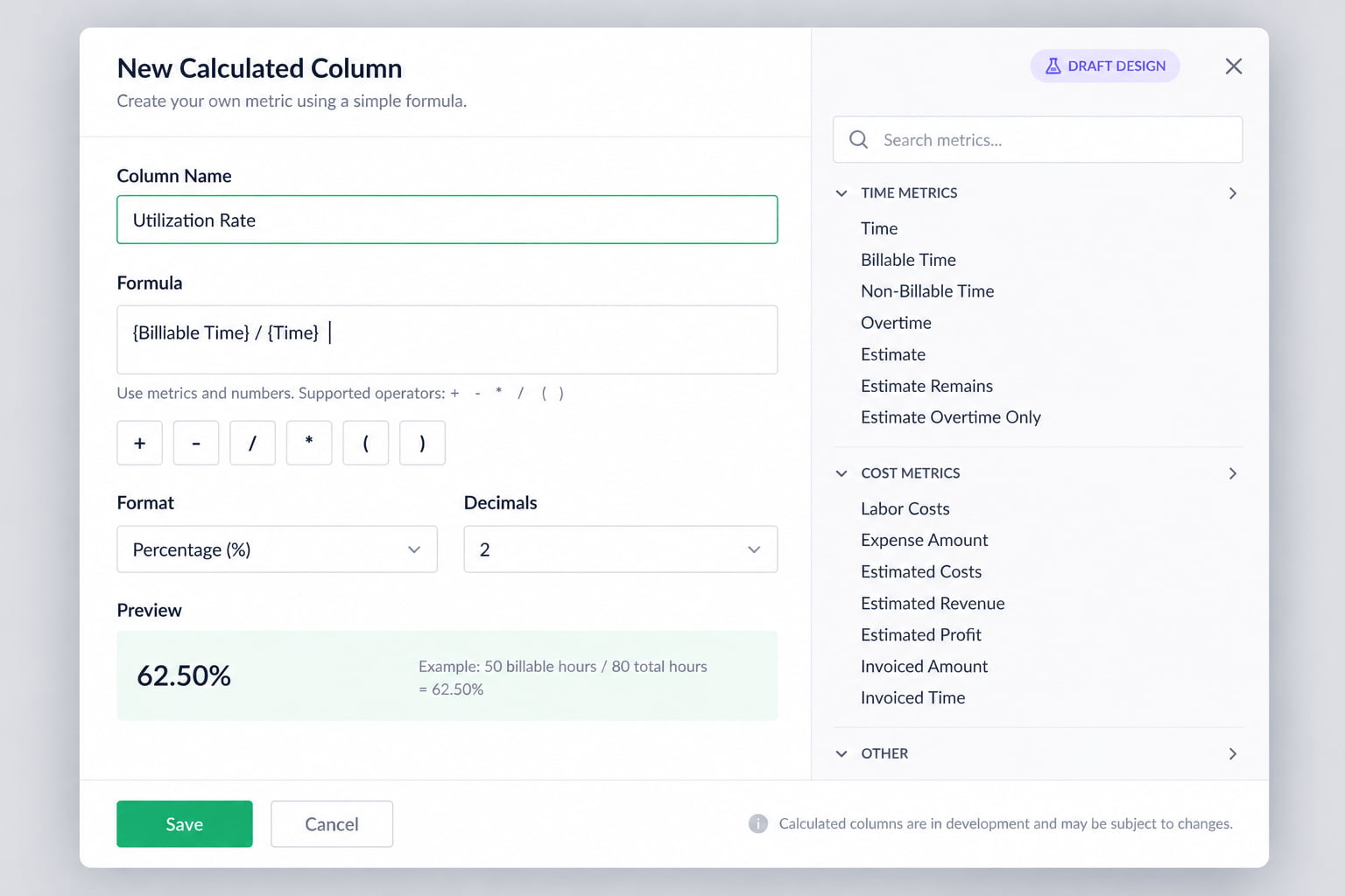
For example:
- Budget Spend = Budget − Time
- Utilization Rate = Billable Time ÷ Time
- Custom Billable Amount = Time × Hourly Rate
This will make it possible to create metrics that are specific to your workflow, without exporting your report and doing the calculations separately.
Member custom fields in reports
We’re also working on Member Custom Fields for Reports.
You’ll be able to add custom fields to member profiles in Everhour — for example, Department, Location, Employee ID, or any other information that is relevant to your team — and then include these fields as columns in your reports.
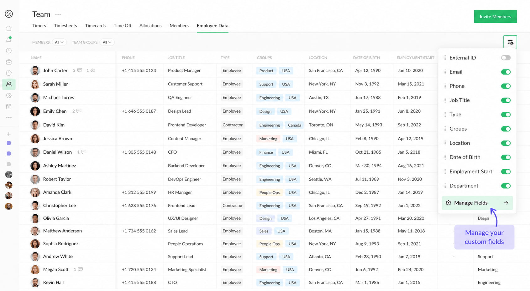
This will make it easier to build reports around the way your organization is structured and combine time and cost data with additional information about your team members.
Both features are currently in development, and we’ll share more as they get closer to release.

Mike
An IT entrepreneur, executive, and former engineer with a passion for innovation and leadership. Mike focuses on driving company growth while keeping the team inspired. Outside of work, he enjoys tennis, snowboarding, traveling, reading, and, of course, putting his heart and soul into Everhour.